Background

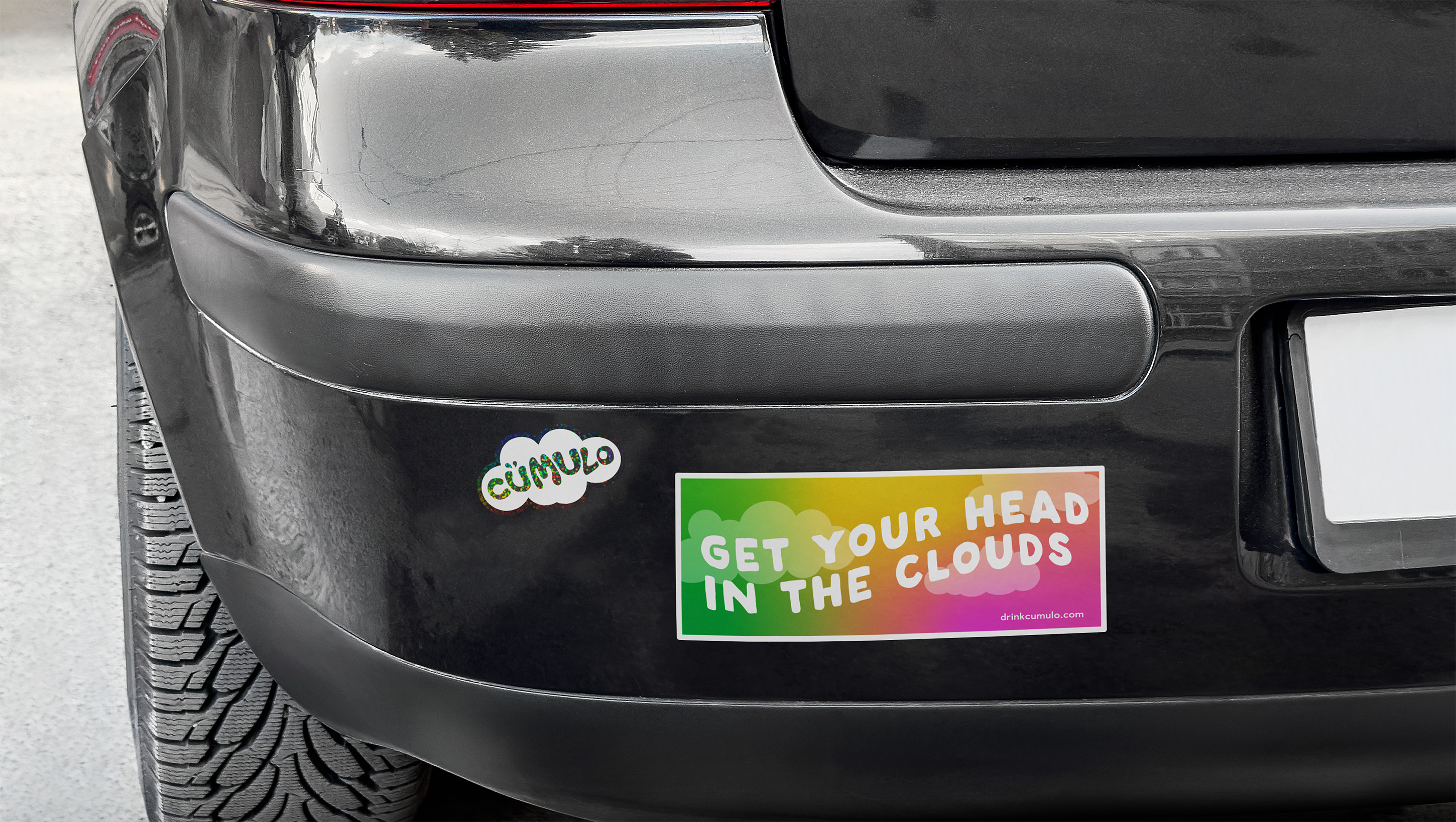
In 2024, Resident Culture Brewing Company, a micro-brewery specializing in craft beer located in North Carolina, set out to launch its first THC-infused sparkling water, Cümulo. As Marketing Designer, I was tasked with the challenge to extend the brewery’s playful, bold, "where your weird is welcome" personality into a new market category rooted in calm, clarity, and modern wellness. My goal was to build a brand identity that felt airy and ethereal, modern, and approachable.

Through market research of existing beverage brands and by applying core design principles of balance, simplicity, and cohesion, I created a visual system that appealed equally to Resident Culture’s loyal craft-beer audience while also resonating with non-drinkers and wellness-minded consumers discovering the brand for the first time.
year

2024

my role

Lead Graphic Designer, Packaging Development & Brand Designer

skills & tools used

Brand Identity Development · Brand Storytelling · Audience Segmentation · Market Analysis · Creative Direction · Packaging Design · Art Direction · Cross-functional Collaboration

Mailchimp · Meta Business Suite · Planable · Canva · Adobe Creative Suite (Illustrator, Photoshop, InDesign)
current market analysis

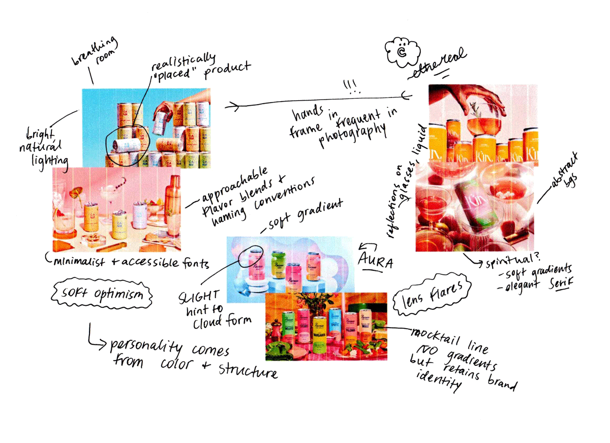
Because Resident Culture was new to the THC beverage category, I began by analyzing market trends and audience behavior across adjacent spaces such as THC, CBD, non-alcoholic, and functional beverages.

I examined how brands like Cann, Recess, and Kin Euphorics targeted key customer segments through lifestyle messaging, design trends, and brand voice and tone. I also studied shelf presence in both bottle shops and wellness retailers to identify competing products and opportunities for visual differentiation.

Designing the brand and visual identity

I translated these insights into a complete visual and verbal identity system that embodied the word Cümulo itself — light, uplifting, and quietly confident.

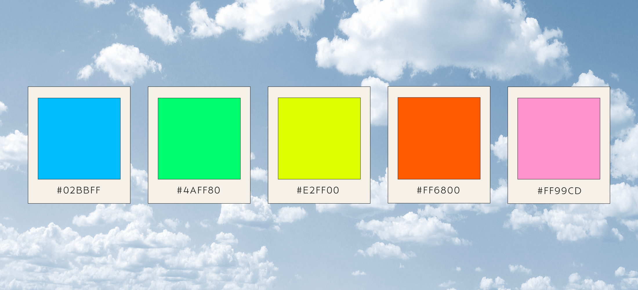
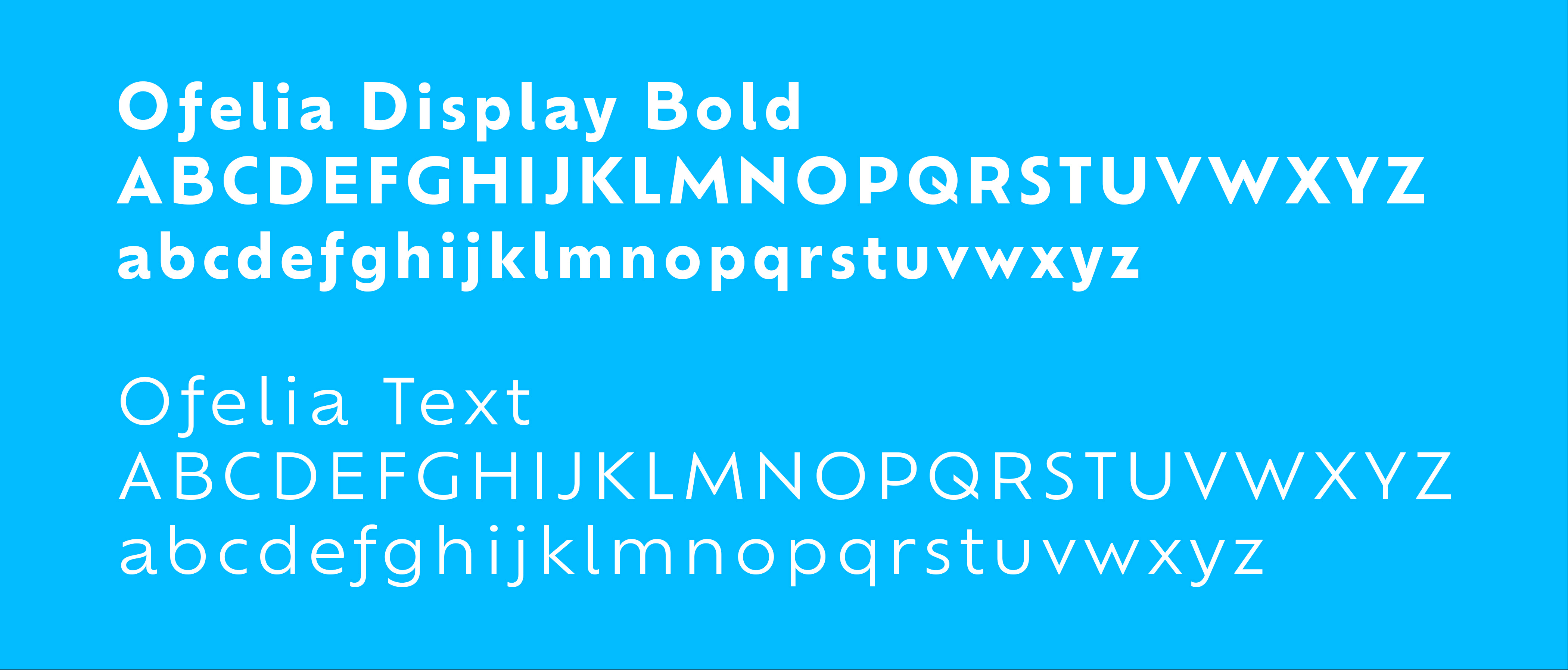
Rounded letterforms, soft gradients, and muted tones communicated calm and elevation, while clear hierarchy and structured layouts kept the system grounded and modern. Every touchpoint — from the logo and color palette to typography, packaging, and merchandise — was guided by brand storytelling principles: clarity, consistency, and emotion.
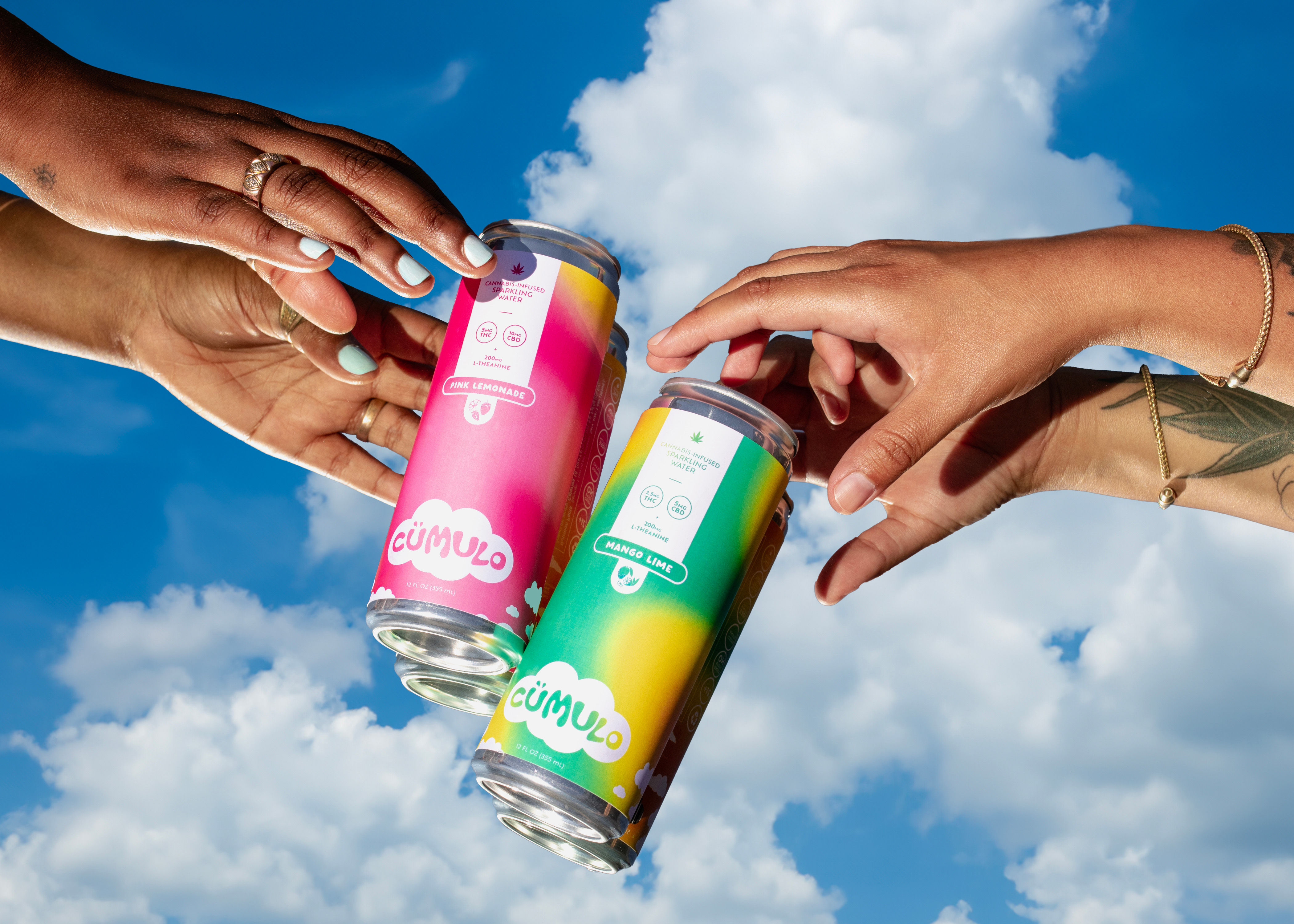
Once the brand design system was established, I defined the art direction that would carry cümulo's tone across photography and digital content. Product and lifestyle shoots were designed and planned to mirror the calm, elevated feel of the brand by utilizing soft lighting, diffused backgrounds, and tactile materials.

This photography direction set the stage for how the brand would appear everywhere else, ensuring cümulo entered this new market as a brand that is clean, intentional, and effortlessly cohesive.
Results & Takeaways

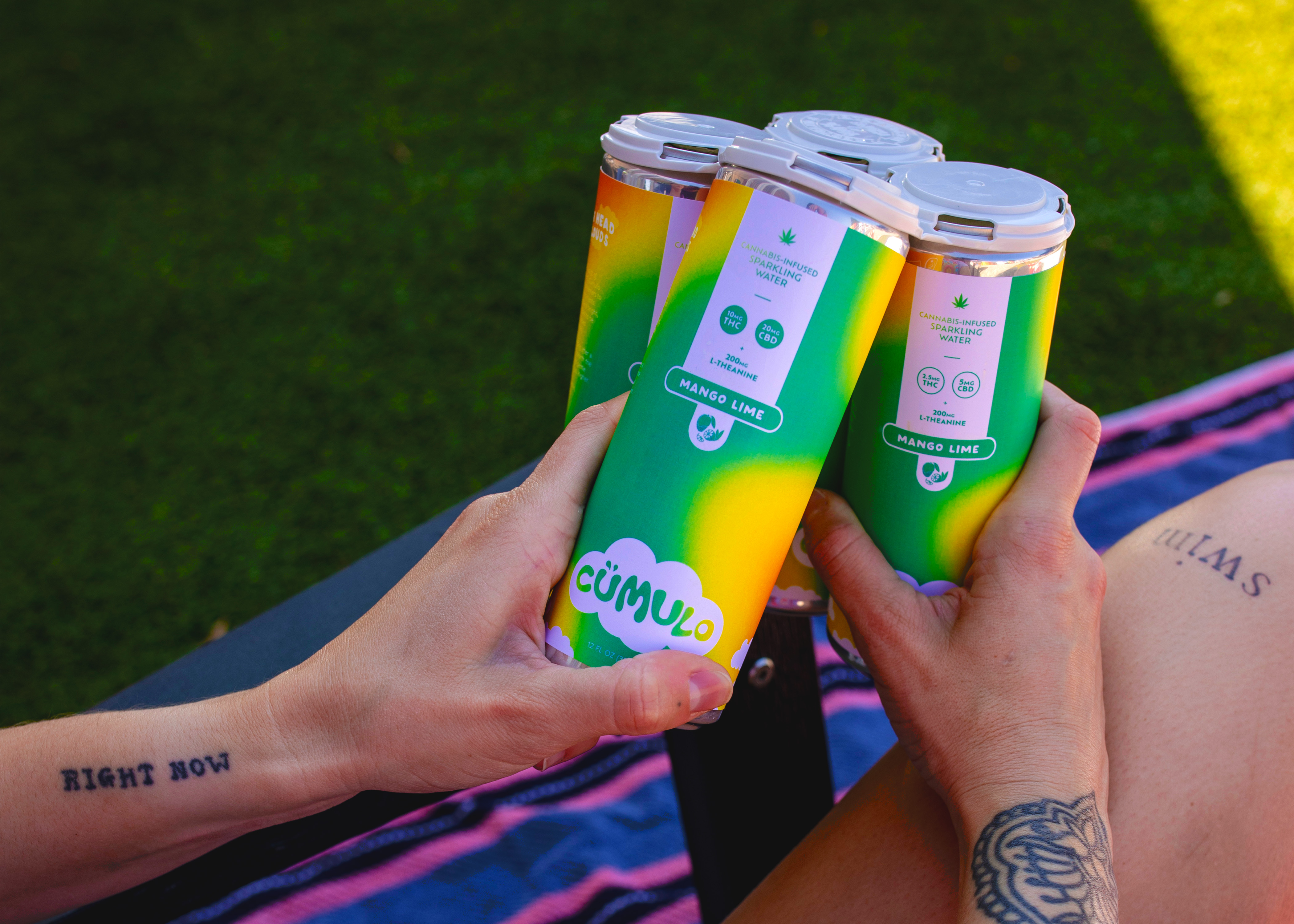
Following the completion of the brand design and photography visual guidelines, I led the creative direction and packaging development for the go-to-market launch. I worked closely with sales, taproom, distribution, and internal teams to ensure the brand performed as beautifully in-market as it did on screen.

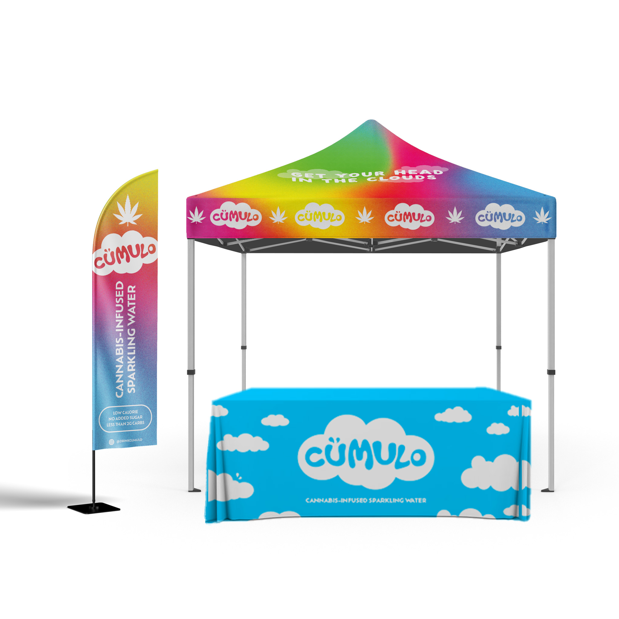
The can’s gradient-forward minimalism extended into web, merch, and promotional design, creating a calm, cohesive presence across every channel.

Cümulo became proof that Resident Culture could expand into new categories without losing its wild and fun personality, while also showcasing my ability to bridge brand vision strategies with real-world execution and design.