brand & identity design

cümulo

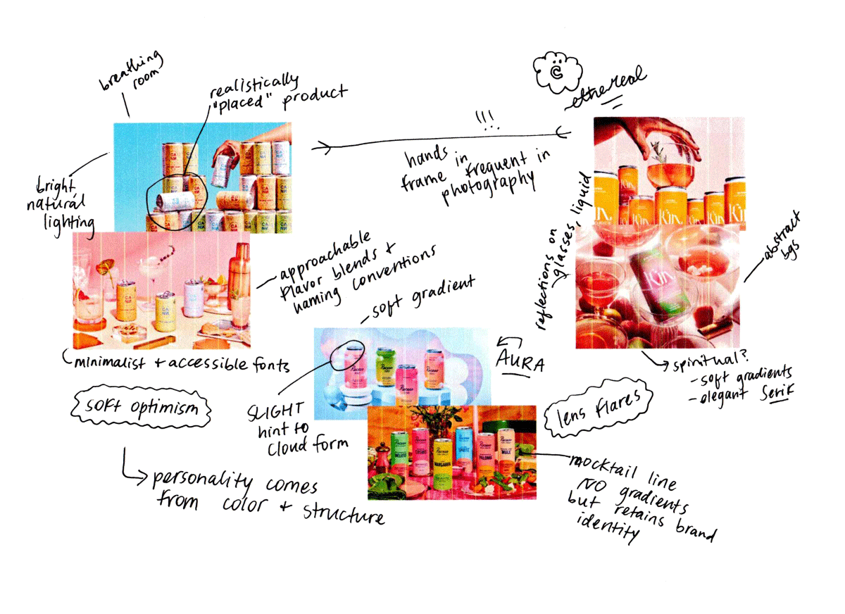
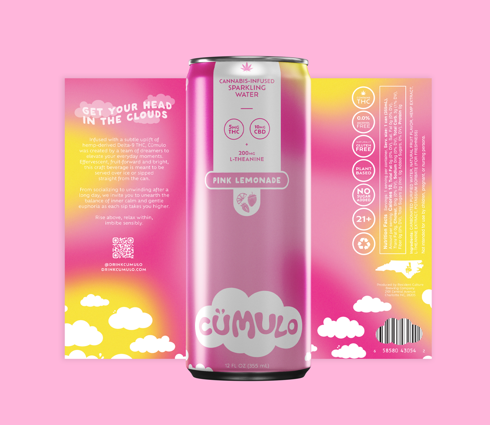
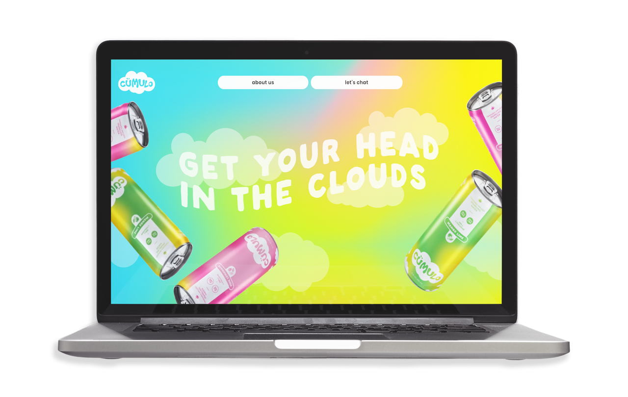
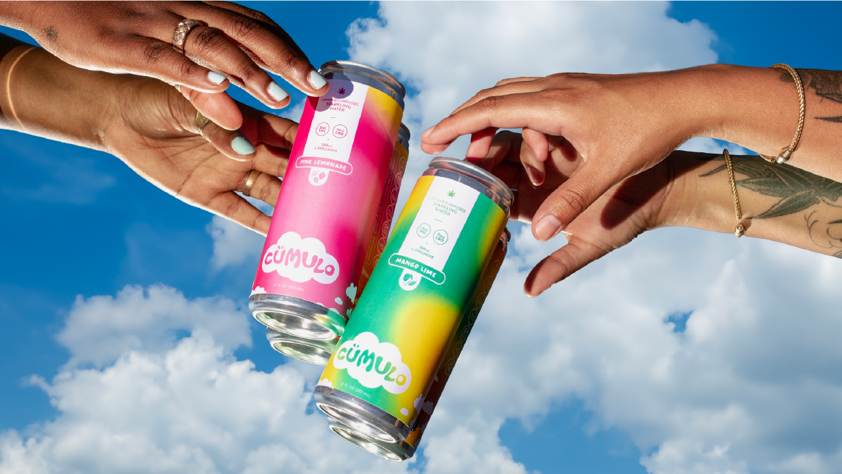
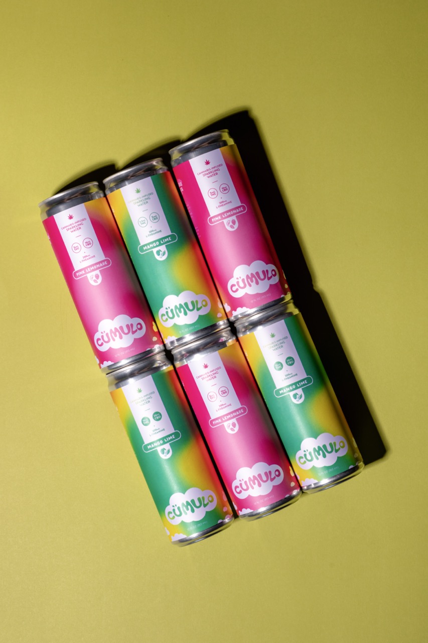
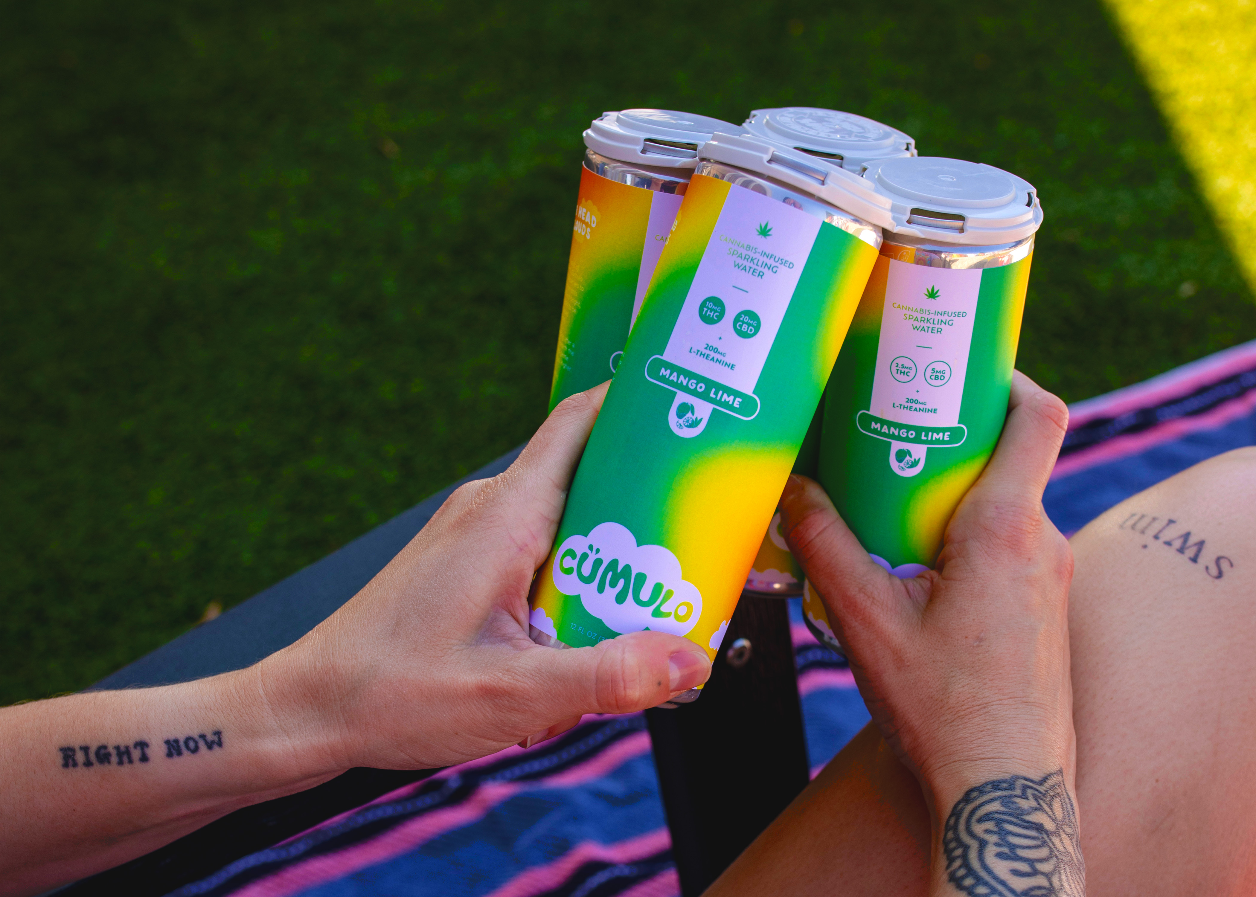
Building a premium cannabis beverage brand that balanced high design with approachability was both a creative and strategic challenge. With cümulo, the goal was create a visual language that captured calm energy, modernity, and quiet confidence while standing apart in an increasingly design-savvy market.

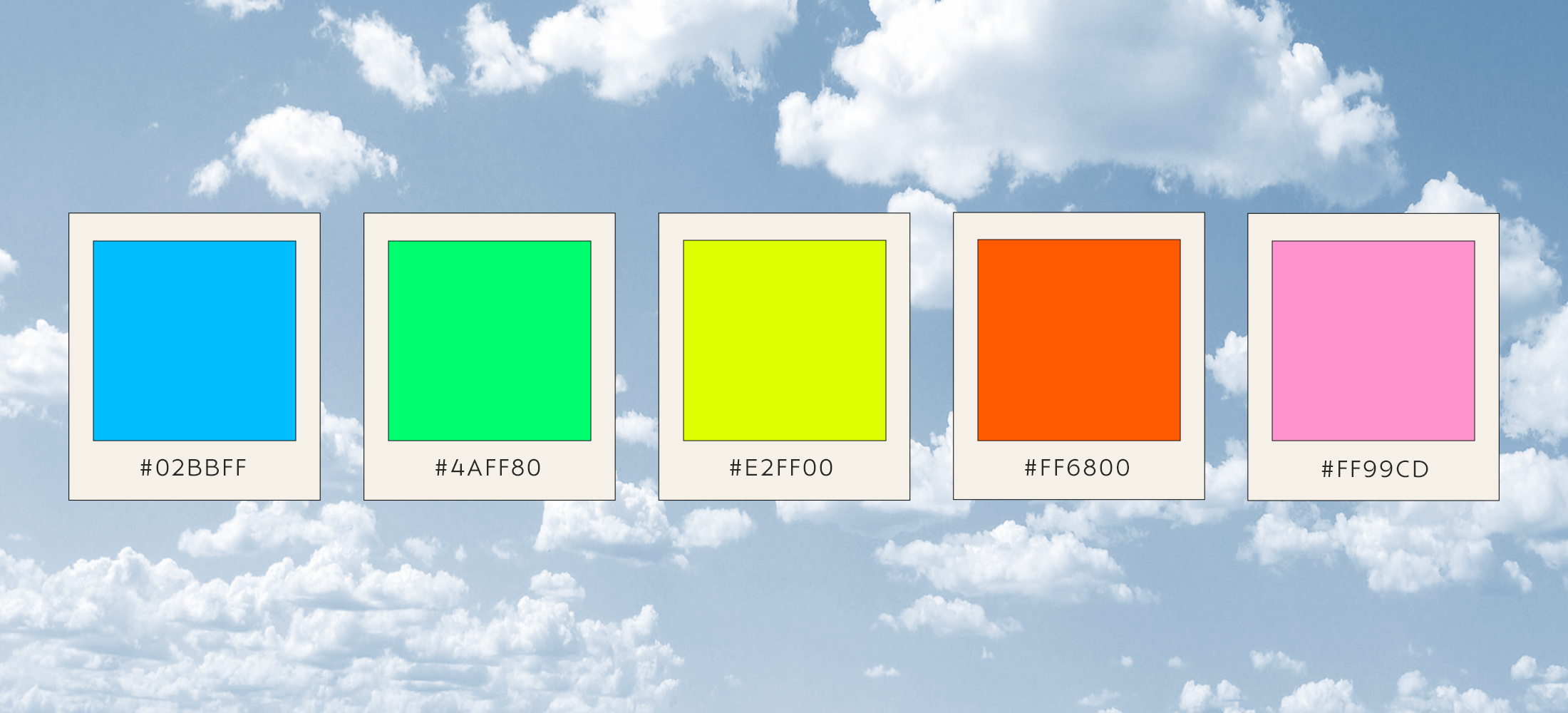
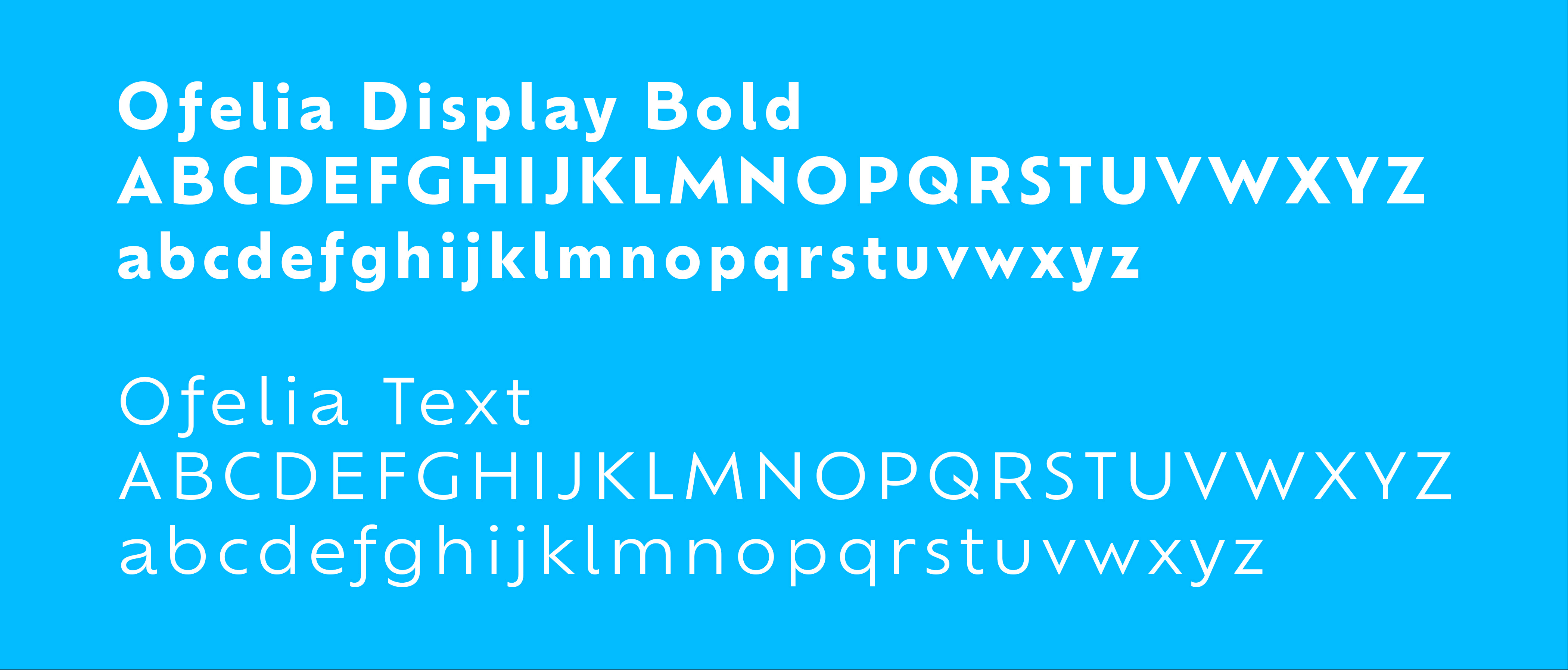
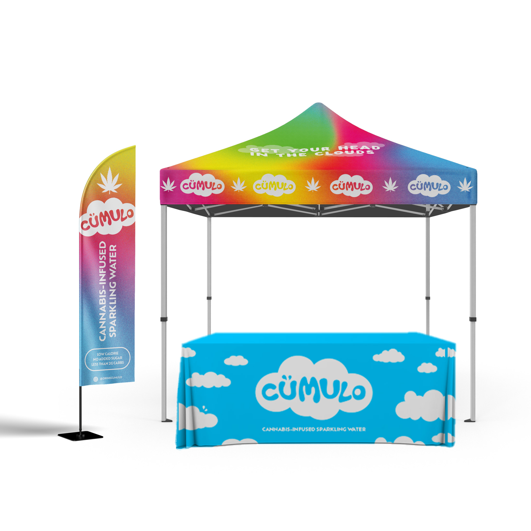
As Lead Designer, I shaped cümulo from concept sketches to product landing on the shelf by developing the brand foundation and guidelines, color palette and font system, packaging system, and out-of-home presence. Each design decision was guided by balance, favoring clarity over clutter and serenity over spectacle. The result was a holistic identity that expressed wellness through simplicity and connected thoughtful design to a sense of lightness and ease.
may 2023 – august 2023
competitor analysis & user insights

Research and Visual Foundations

To ground my creative direction, I conducted in-depth research across more than 20 existing cannabis and wellness beverage brands, analyzing design trends, packaging forms, and messaging strategies. This competitive audit revealed clear visual patterns, from bright, youthful aesthetics to restrained luxury cues, helping identify whitespace for a more balanced, elevated approach.

To refine the brand’s voice and tone, I also surveyed a 15-person focus group of existing and potential consumers, testing visual mood boards and naming directions. The insights gathered from both stages shaped the foundational design principles for cümulo.

key elements & decisions

Colorful mesh gradients, a 5-swatch neon color palette, and noise texture overlay were selected as key label design elements to align with 2025 cannabis beverage trends. These elements ensured shelf standout with modern energy while appealing to wellness-focused younger consumers seeking calm excitement over gimmicks. The noise texture added craft depth, balancing boldness with approachability for target audience resonance.

Designing with Intention

Every element of the cümulo label was designed with intention. The hierarchy had to work within the printer’s crop and bleed requirements while still giving immediate priority to dosage, flavor, and product type, so key details are centered and supported by a clear system of filled and unfilled bubbles to distinguish strengths at a glance.

The mesh gradients shift by flavor and are paired with simple fruit illustrations for quick recognition and accessibility, while the QR code creates a direct path to lab analysis and the brand site without disrupting the layout.

Even utility details, like the barcode, were integrated into the cloud motif so the back panel feels cohesive and uninterrupted, reinforcing the brand story rather than competing with it.